Peel
Peel it all back, one sip at a time.
-
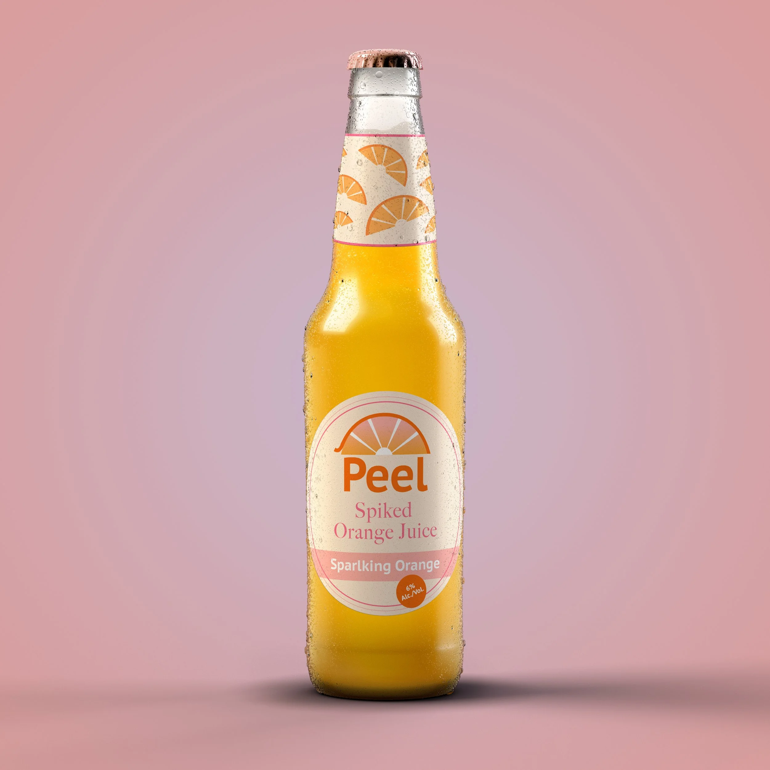
Peel Bottle Design
Designed to be photo ready on the brunch table.
-
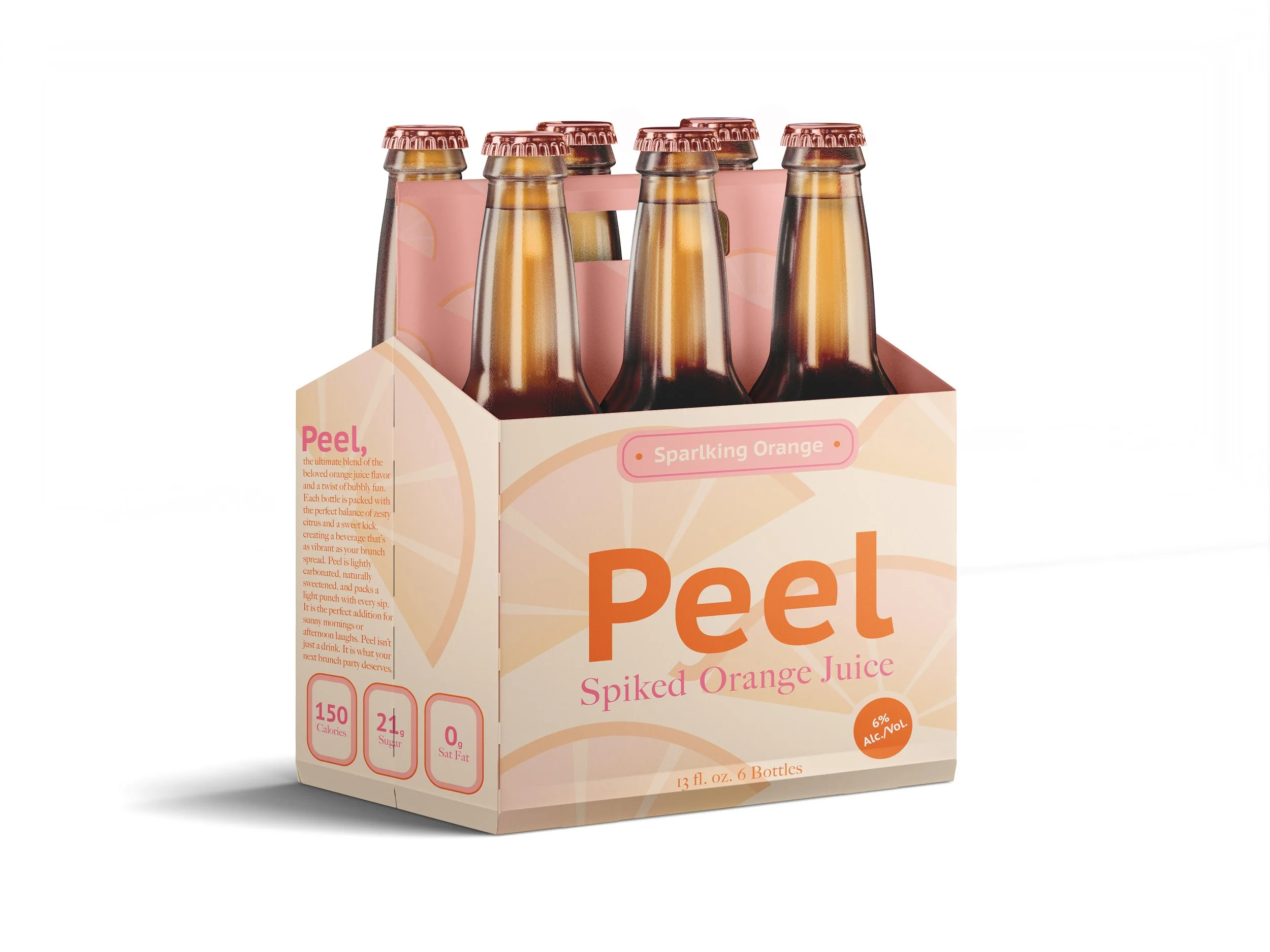
Peel 6 Pack Design
Even the outside packaging is photo ready!
-
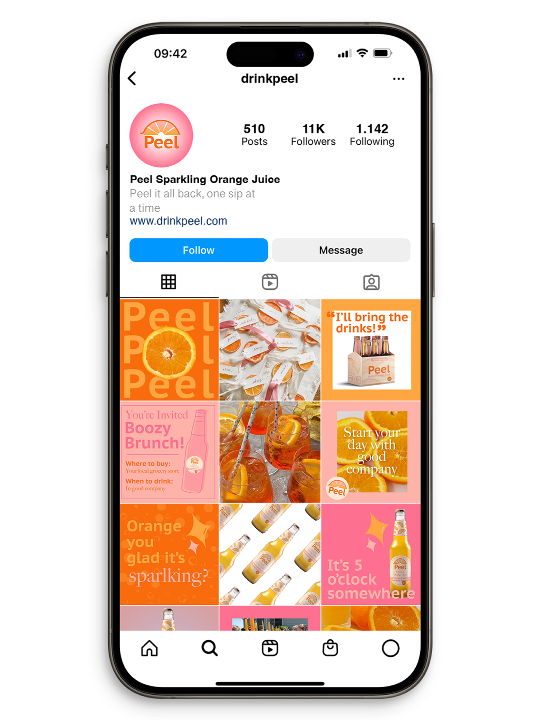
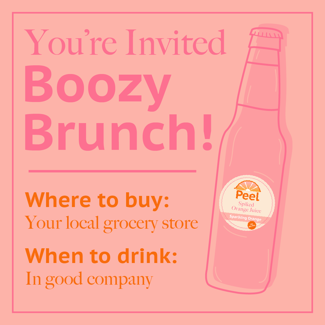
Peel Instagram Design
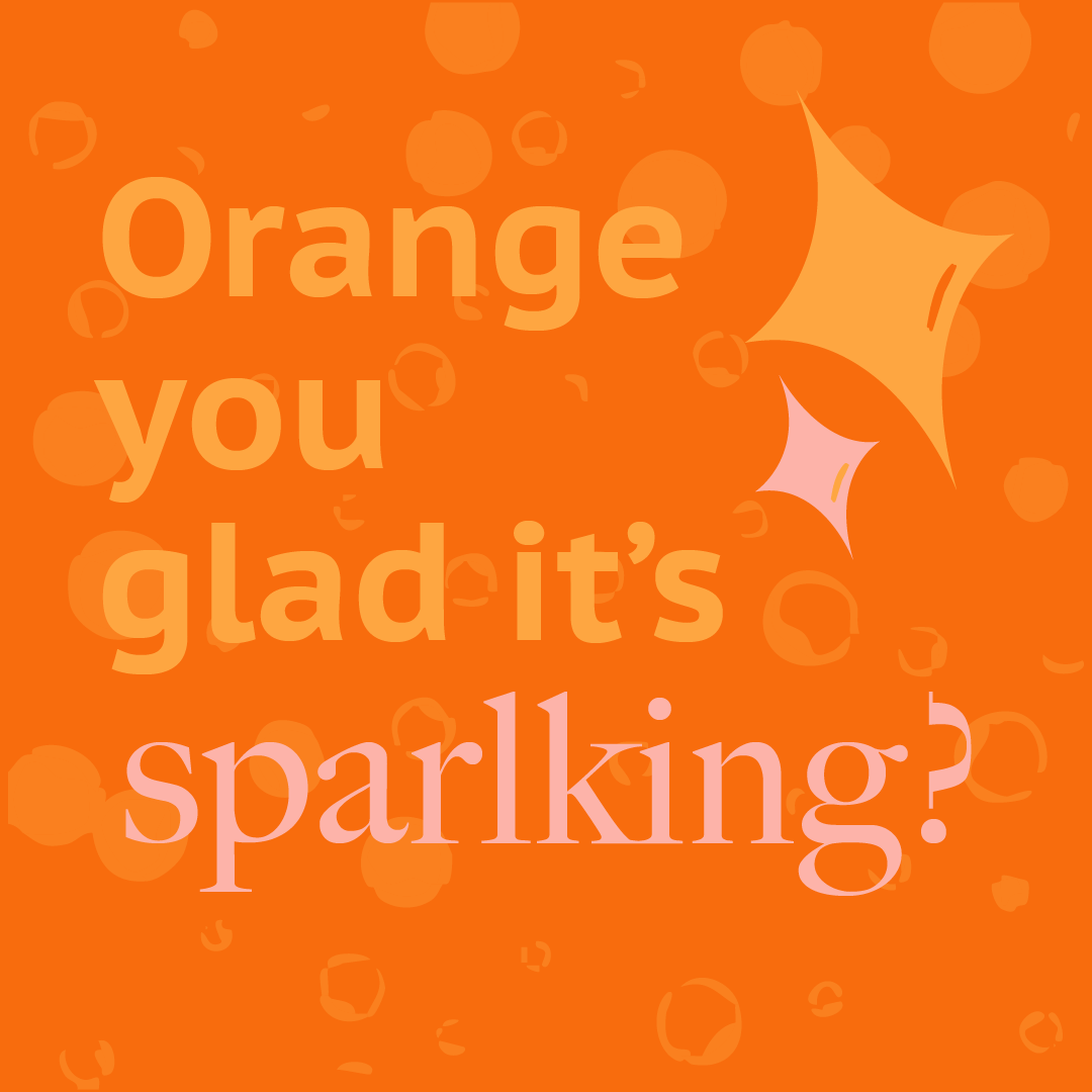
Using the bright sunrise theme to appeal to the target audience.
Peel Branding
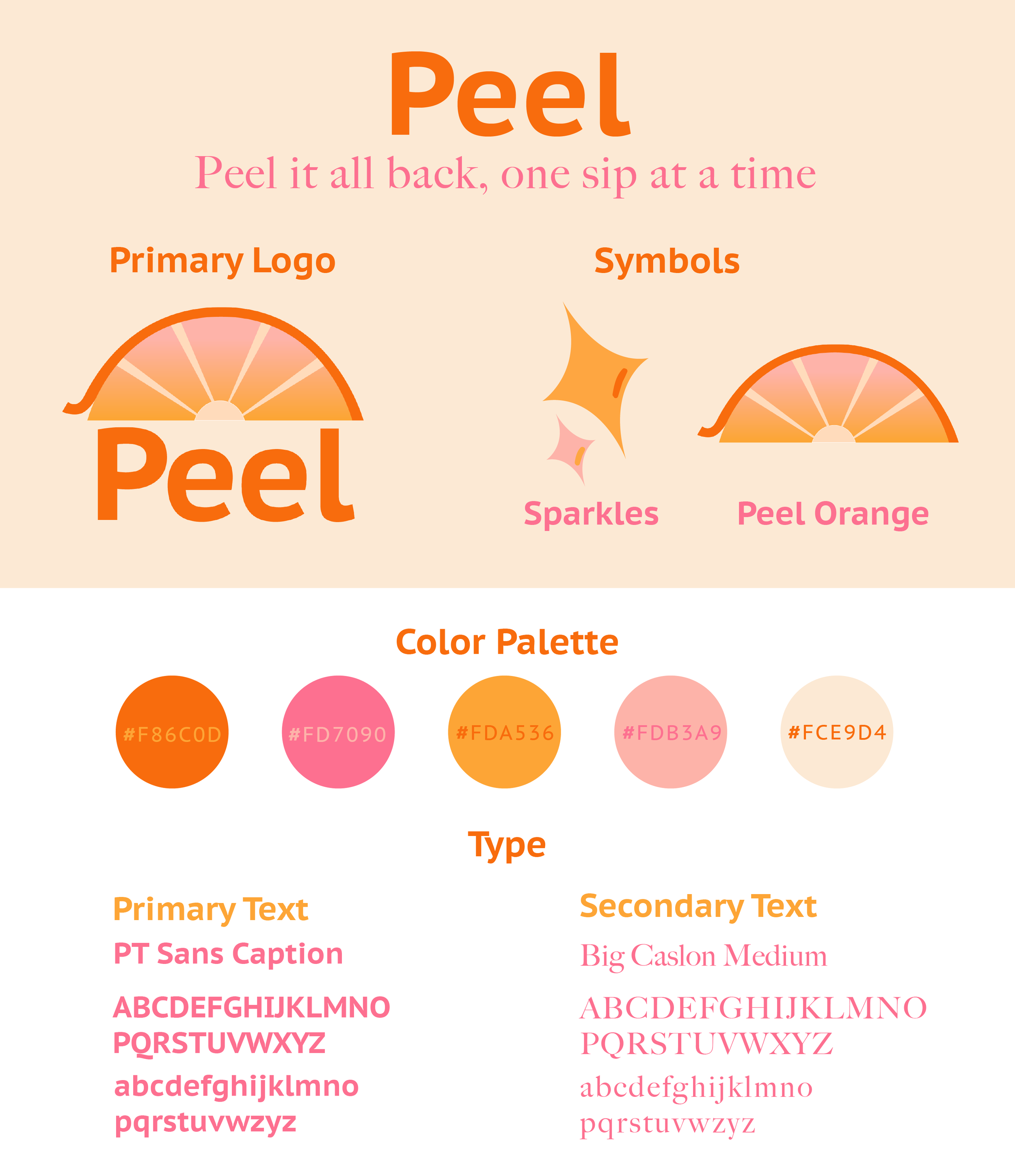
Peel is a sparkling orange juice, designed to be photo-ready at your next brunch party, utilizing sunrise colors to help kickstart a sparkling day.
-
Logo:A peeling orange with a sunrise in the middle symbolizes the name of the brand and the targeted time to drink Peel.
Symbols:
The sparkles are used often in the brand as imagery for the experience of taking a sip of Peel.
Color:
Using a mix of oranges and pinks to represent orange juice and a sunrise.
Type:
Strong and trendy type to represent the sparkling orange juice punch, mixed with a classic typeface to fit with the brunch feel.
-
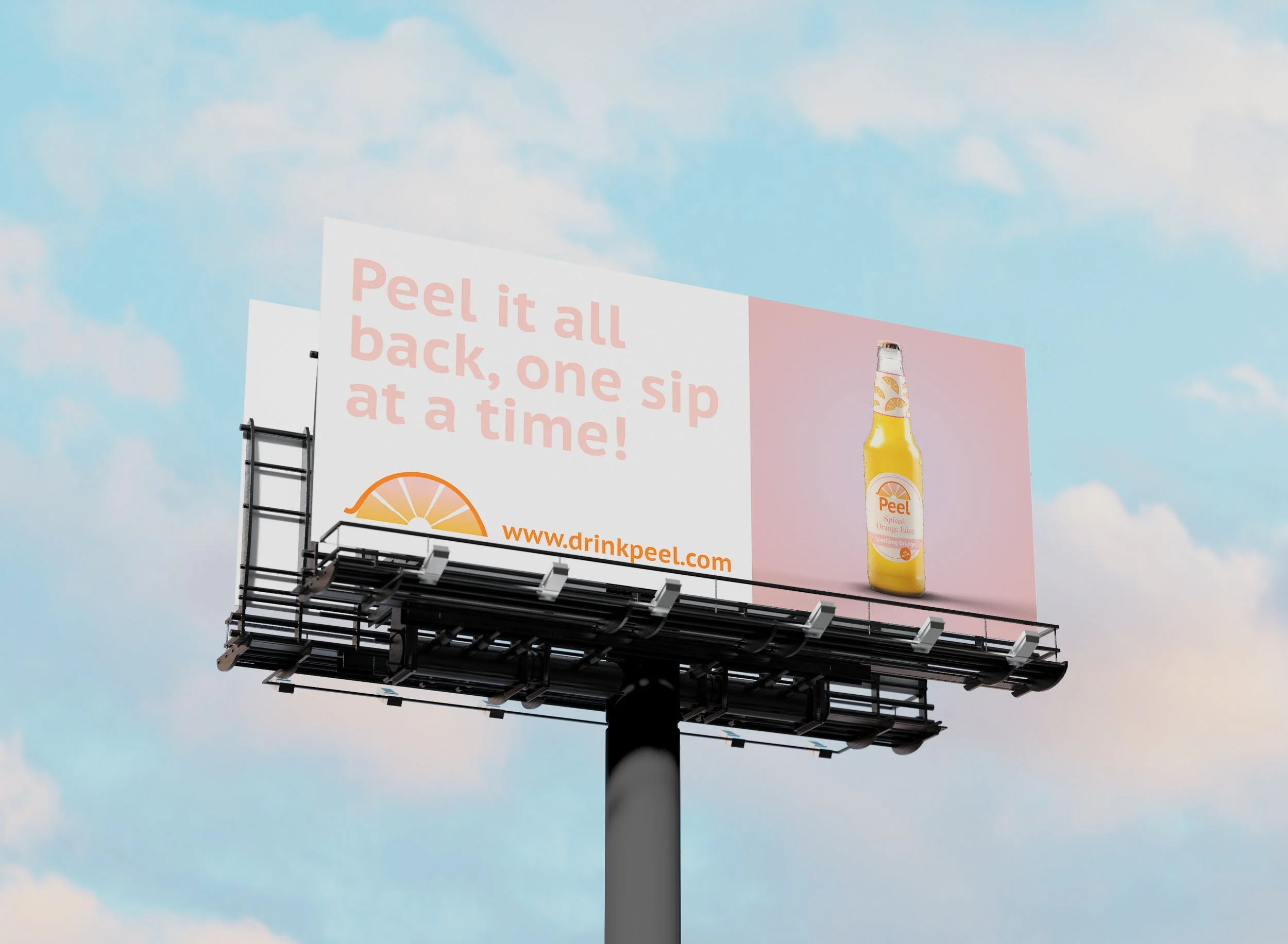
Using our tagline, “Peel it all back, one sip at a time”, with the product image to appeal to our market.


